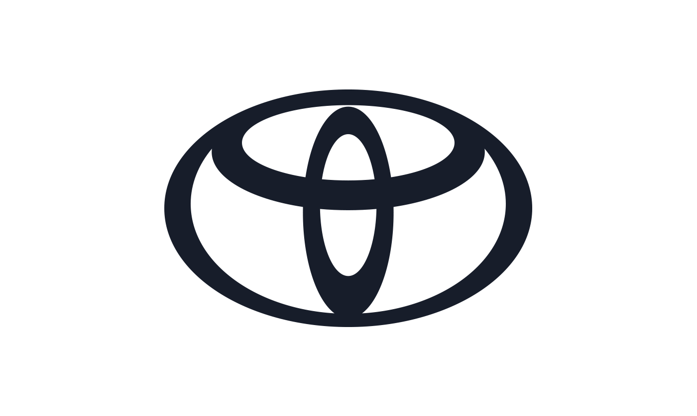
The Toyota logo is an important part of our identity – but have you ever wondered why it is made up of three interlocking ovals, or what it means?
First introduced in October 1989 to mark Toyota’s 50th anniversary, it took around five years to develop the three-oval logo. The emblem was designed to create a strong, stand out visual identity for the brand and announce the arrival of Toyota in many countries outside of Japan.
The three ovals in the Toyota logo are linked in a horizontally symmetrical layout – so it is recognisable both head-on and when seen in a rear-view mirror.
The inner ovals symbolise the heart of the customer and the heart of the company, overlapping to represent a mutually beneficial relationship and trust between the two, as well as forming a ‘T’ shape for Toyota. The outer oval one signifies the world embracing Toyota.
Each oval is drawn with different stroke thicknesses, pointing to Japanese calligraphy art and culture.
The space in the background within the logo is meant to exhibit the ‘infinite values’ which Toyota stands for. These are: superb quality, value beyond expectation, the joy of driving, innovation, and integrity in safety, the environment and social responsibility.
Toyota Motor Europe introduces a new brand logo and design language
On 20 July 2020, Toyota introduced a new brand design in Europe with a reworked version of its brand logo and typography. It signals a new era for Toyota as it transitions from a car company to a mobility company.
Developed for an increasingly diverse customer base that is coming to Toyota for an expanding range of mobility products and services, the new design language operates fluently across all digital and physical touchpoints.
The new Toyota logo and visual identity is driven by simplification and has been shaped by four key principles: forward-thinking, mobile-ready, more premium feel and consistency across all business units and sub-brands.
Toyota’s new brand logo distils its emblem to a simple, two-dimensional design. The Toyota wordmark has been deleted, as the emblem itself is well-known across Europe. The design communicates simplicity, transparency and modernity. It is perfectly adapted to the digital space but equally effective in the physical world. The new logo will be applied across all communication touchpoints, while the current logo will continue to be used for Toyota vehicles.
The new visual identity comes with a new, bespoke typography, Toyota Type. This is multi-purposed for both on and off-line environments and marks a step-up in digital readiness as the company expands its online retailing in Europe.
Didier Gambert, Toyota Motor Europe Vice President Sales, Marketing and Customer Experience, said: “We developed the new brand visual design with ‘tomorrow’ in mind. Our focus was on enabling ever-better customer connections, allowing them to keep pace with Toyota’s rapid expansion of electrified vehicles, mobility services and online retailing. The design was re-purposed to better connect with customers across diverse touchpoints.”
See also:
History of Toyota cars

The Toyota oval logo was first used on the Toyota Celsior – a model sold in Japan, as it was badged as a Lexus LS400 elsewhere.


Its much simpler than that… Toyota runs rings round the opposition in all directions
“The only one in the ring”, you might say!
But we know another version —— the vertical ring is needle eye and horizontal two rings is threaded thread
Hi Boris,
Thanks for getting in touch.
That’s an interesting theory, however, the inner ovals symbolise the heart of the customer and the heart of the company, overlapping to represent a mutually beneficial relationship and trust between the two, as well as forming a ‘T’ shape for Toyota. The outer oval one signifies the world embracing Toyota.
Thanks.
Dang, I never realized your logo had such a deep meaning. I thought it was just a bunch of circles arranged so that they look cool 😛
When looking at the logo on my local dealership recently, I also saw an Angel in the logo.
One Toyota dealer personnel in Springs, Ekurhuleni once told me that the toyota logo comprising of tree rings, each ring stands for something – first ring stands for Reliability, second ring for Endurance and the third ring for Durability.
All the letters in Toyota are within the logo very efficient. Very clever too from the best car maker in the world.
Thanks for your kind words and support, Faisal!
I think it looks like a weird cowboy hat.
Well that’s certainly a different way of viewing it, Munkee!
There is actually a deeper meaning hidden behind the circles making up the Toyota logo, with the inner ovals symbolising the hearts of the customer and the company and overlapping to highlight the mutually beneficial relationship and trust that exist between the two. On a higher level, these also form a ‘T’ shape for Toyota.
The world embracing Toyota is represented by the outer oval, and the background space within the logo signifies the infinite values that Toyota stands for.
Thanks.
I heard that the Toyota badge ovals spelt the word TOYOTA is there any troth in this?
Hi Samuel, thanks for getting in touch.
Yes this is true!
Thanks.
i think it is more looks like the head of the tamaraw. A buffalo that can be found only here in Mindoro, Philippines
I want it